
Readers are probably getting completely sick of endless county-level maps of 2000 Census data, but I haven't quite run out of questions that interest me that I can answer that way.
Therefore, above is education (actually, the fraction of the population over 25 with a bachelor's degree, with white being two standard deviations below the county average - which corresponds to 0.95% of the population educated! - and saturated blue being two standard deviations above - 32% college degreed).
Next is one of those two-factor correlation maps for education and median household income. Dark means both education and income are high (SF Bay area, New York), light means both are low (Appalachia). Purplish means counties have relatively high education for their income, greenish means relatively high income for their education.
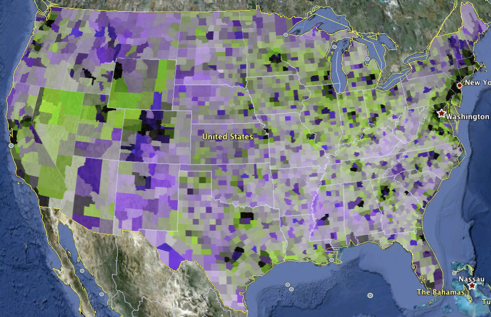
I'm not quite sure what to make of this other than the obvious fact that vibrant cities have both high education and high income. Speculate away!

6 comments:
Can you correlate this info with voting patterns for recent elections? I'm not sure if that would "prove" anything, but it would be interesting nonetheless.
This is fascinating. The second map seems to imply that urban zones with high education and income create surrounding green zones with high income and low education, while the rural areas are left out entirely. An interesting comment on urban vibrancy.
There are a number of factors that contribute to the patterns in the education map. Three examples:
1) In Nebraska, the counties that include one of the public four-year universities or colleges stick out from the rest of the state. Similarly, Penn State really makes Centre County in Pennsylvania stand out. And Brazos county with Texas A&M. In addition to the faculty and administrators proper, the presence of a four-year school creates demand for a variety of other services that generally require a college degree.
2) The broad swath of dark blue down the Rocky Mountains in Colorado is symptomatic of the "Colorado Paradox" in education: Colorado is one of the top states in the country for percent of residents with a degree, even though we do a fairly crappy job of graduating our local kids from high school and college. LOTS of college graduates move to the state, and to the resort towns in the mountains. If you eat at a restaurant in Vail or Aspen, chances are very good that your waitperson has a bachelors degree or higher.
3) West of the 100th meridian, some of the appearances are deceiving because the counties are so large in area. A county bigger than Connecticut may be shown in darker blue, even though the college graduates are concentrated in one smallish city.
Burk Braun: "The second map seems to imply that urban zones with high education and income create surrounding green zones with high income and low education, while the rural areas are left out entirely. An interesting comment on urban vibrancy."
And one of the interesting policy issues that has been around for a very long time: cities are the drivers for economic growth, cities are entirely dependent on the ability of the rural areas to produce excess calories, how do you share the urban wealth with the rural areas?
For example, the "Roaring 20s" were a purely urban phenomenon. During the 1920s the rural areas of the US were extremely poor. FDR's New Deal made several conscious efforts to see that the rural areas were not pushed into a permanent second-class status: TVA, REA, and lots of mechanisms for crop price supports. State governments followed suit with things like tariffs for phone service that intentionally forced urban areas to subsidize service in rural areas.
Just an opinion, but peak oil is likely to create the problem all over again. So many of the proposed responses to make the US more energy efficient simply don't work in rural areas.
Burk:
It does rather look that way doesn't it? Poorer less-educated workers living on the outskirts of the city where they can afford it? I'll try to follow-up on that pattern once I get to the point that I can deal with census-tract level data.
Hi Stuart,
for some reason the google 'follow' feature keeps failing.
Could you provide an RSS feed? I can't seem to find one.
Thanks,
Will
Post a Comment